Python vs NCL

通过示例对比Python和NCL,感受两种语言的区别。

NCL语言大概是从2018年开始,陪伴我走过了一年的时间,也帮助我发表了自己的第一篇文章。后来由于自己需要实现的算法过于复杂,自己无力编写,在朋友的诱惑下不得不转投Python,靠网上各路大神的帖子东拼西凑满足自己的科研需求。说卸磨杀驴也有点不合适,但在适应了Python之后,我确实基本没有再打开过NCL了。最近整理文件,找到了自己发表第一篇学术垃圾时候的NCL脚本,心血来潮的想再用Python实现一遍。也算是对评论里很多读者的一个回应吧(貌似气象家园帖子下边第一个评论就是希望我写一个两者对比的文章,被我鸽到现在,咕咕咕)。注:编程水平仅限于能跑就行,warning不管,冗杂语句请忽视。
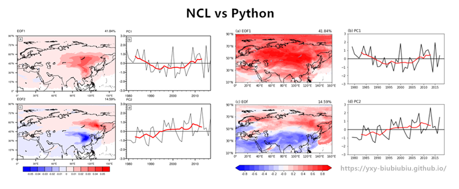
示例1(EOF)

选择EOF的原因是图片内容较为丰富,同时方法较为常用

由于原始数据过大,只提供处理好的数据方便测试(数据为每年的寒潮路径的概率密度分布,为39年×90纬度×360经度,由FLEXPART模式追踪后通过高斯核密度估计算法Gaussian KDE得到。

测试数据和代码如下:

  1. 测试数据 2. NCL代码 3. Python代码

    先对比下出图效果(两种语言对图形的渲染有差异,EOF算法可能也有些差异,但是结果是基本相同的,图只经过了基础的调整,并不是很好看)。

    NCL vs Python

1 准备工作

NCL:在引入一些特殊函数(NCL本体不具备的函数)时,通常会加上类似于以下语句:

1
load "$NCARG_ROOT/lib/ncarg/nclscripts/csm/contributed.ncl"

Python:引入各个模块(库):

1
2
3
4
5
6
7
8
9
10
11
12
13
14
15
16
17
import xarray as xr
import numpy as np
from eofs.standard import Eof
import cartopy.crs as ccrs
import cartopy.feature as cfeature
import matplotlib.pyplot as plt
import cartopy.mpl.ticker as cticker
def contour_map(fig,img_extent,spec):
fig.set_extent(img_extent, crs=ccrs.PlateCarree())
fig.add_feature(cfeature.COASTLINE.with_scale('50m'))
fig.add_feature(cfeature.LAKES, alpha=0.5)
fig.set_xticks(np.arange(leftlon,rightlon+spec,spec), crs=ccrs.PlateCarree())
fig.set_yticks(np.arange(lowerlat,upperlat+spec,spec), crs=ccrs.PlateCarree())
lon_formatter = cticker.LongitudeFormatter()
lat_formatter = cticker.LatitudeFormatter()
fig.xaxis.set_major_formatter(lon_formatter)
fig.yaxis.set_major_formatter(lat_formatter)

2 数据读取

NCL

1
2
3
4
f=addfile("out.nc","r");读取文件
dot=f->cspath(:,:,{0:180});读入变量
dot:=dot(lat|:,lon|:,year|:);调整变量维度顺序(EOF函数对维度顺序有要求)
x=ispan(1979,2017,1);时间

Python:利用Xarray库读取NC文件

1
2
3
4
5
f = xr.open_dataset("out.nc" )
dot = np.array(f['cspath'].loc[:,0:90,:])
lat = f['lat'].loc[0:90]
lon = f['lon']
years = range(1979, 2018)

3 EOF

NCL

1
2
3
4
5
eof=eofunc_Wrap(dot,3,False)
pc=eofunc_ts_Wrap(dot,eof,False)
pc=dim_standardize_n(eof_ts,1,1)
copy_VarMeta(dot(:,:,0),eof1);将维度信息重新赋值给新数组
copy_VarMeta(dot(:,:,0),eof2)

Python:利用EOF库

1
2
3
4
solver = Eof(dot)
eof = solver.eofsAsCorrelation(neofs=2)
pc = solver.pcs(npcs=2, pcscaling=1)
var = solver.varianceFraction()

4.1 绘图:建立画布

NCL的有些绘图参数并不是必要的,由于年代久远,我记不清起每条语句对应的详细功能了。

NCL

1
2
3
4
5
6
7
8
wks=gsn_open_wks("pdf","tmp")
res = True
res@gsnMaximize = False
res@gsnDraw = False
res@gsnFrame = False
res@gsnDraw=False
res@gsnFrame=False
respc=res;实际上是设置PC图形的基础绘图参数

Python

1
fig = plt.figure(figsize=(15,15))

4.2 绘图:绘制EOF

NCL:其绘图思路是每一条语句指定一个绘图效果,通过不断的”叠BUFF“实现全部要素的叠加,先将共同要素叠给res,然后通过res1=res, res2=res赋值后,再对res1和res2分别添加各自的属性。

1
2
3
4
5
6
7
8
9
10
11
12
13
14
15
16
17
18
19
20
21
22
23
24
25
26
27
res@mpMaxLatF=90;设置经纬度边界
res@mpMinLatF=0
res@mpMaxLonF=160
res@mpMinLonF=0
res@mpFillOn =False;地图设置
res@mpOutlineOn = True
res@mpDataBaseVersion = "MediumRes"
res@mpDataSetName = "/data/home/Earth..4"
res@cnFillPalette = "MPL_bwr"
res@cnFillOn = True
res@cnFillDrawOrder = "PreDraw"
res@cnLinesOn = False
res@cnLineLabelsOn = False
res@gsnLeftString=""
res@pmTickMarkDisplayMode = "Always"
res@cnLevelSelectionMode="ExplicitLevels"
res@cnLevels =(/-0.05,-0.04,-0.03,-0.02,-0.01,0,0.01,0.02,0.03,0.04,0.05/)
res1=res
res2=res
res1@gsnRightString = "41.84%"
res1@gsnLeftString = "EOF1"
res1@lbLabelBarOn=False
res2@gsnRightString = "14.59%"
res2@gsnLeftString = "EOF2"
res2@lbLabelBarOn=True
map1 = gsn_csm_contour_map(wks,eof1,res1) ;绘图
map2 = gsn_csm_contour_map(wks,eof2,res2)

Python:与NCL相似的地方在于需要对每个axes添加参数,不同的地方在于其一条指令可以包含多个效果(比如将所有设置填色绘图的参数全部加在f_ax1.contourf里)。

1
2
3
4
5
6
7
8
9
10
11
12
13
14
15
16
proj = ccrs.PlateCarree(central_longitude=80) #投影
leftlon, rightlon, lowerlat, upperlat = (0,160,10,90) #地图边界
img_extent = [leftlon, rightlon, lowerlat, upperlat]
f_ax1 = fig.add_axes([0.1, 0.32, 0.3, 0.4],projection = proj)#EOF1
contour_map(f_ax1,img_extent,20) #利用前边自定义的绘图函数,目的是省去绘制相同图形时需要再次设置地形,湖泊,轴刻度等参数
f_ax1.set_title('(a) EOF1',loc='left')#左标题
f_ax1.set_title( '%.2f%%' % (var[0]*100),loc='right')#右标题,解释方差
f_ax1.contourf(lon,lat, eof[0,:,:], levels=np.arange(-0.9,1.0,0.1), zorder=0, extend='both',transform=ccrs.PlateCarree(), cmap=plt.cm.RdBu_r)#绘制填色
f_ax2 = fig.add_axes([0.1, 0.1, 0.3, 0.4],projection = proj)#EOF2
contour_map(f_ax2,img_extent,20)
f_ax2.set_title('(c) EOf',loc='left')
f_ax2.set_title( '%.2f%%' % (var[1]*100),loc='right')
c2=f_ax2.contourf(lon,lat, eof[1,:,:], levels=np.arange(-0.9,1.0,0.1), zorder=0, extend='both', transform=ccrs.PlateCarree(), cmap=plt.cm.RdBu_r)
#绘制色标
position=fig.add_axes([0.1, 0.17, 0.3, 0.017])
fig.colorbar(c2,cax=position,orientation='horizontal',format='%.1f',)

4.3 绘图:绘制PC

NCL

1
2
3
4
5
6
7
8
9
10
11
12
13
14
15
16
17
18
19
20
21
22
23
24
25
26
27
respc@gsnYRefLine=0
respc@trYMinF=-3
respc@trYMaxF=3
res9 = respc
respc@tmYLLabelDeltaF=-1
respc@trXMinF=1979
respc@trXMaxF=2017
respc@tiYAxisOn=False
respc@tmXTOn =False
respc@tmYROn = False
respc@vpHeightF=0.39
respc@vpWidthF=0.6
respc@gsnLeftStringOrthogonalPosF = 0.04
respc1 = respc
respc1@gsnLeftString = "PC1"
respc2 = respc
respc2@gsnLeftString = "PC2"
pc1= gsn_csm_xy(wks,x,eoft1,respc1)
pc2= gsn_csm_xy(wks,x,eoft2,respc2)
pc1_9 = runave_n_Wrap(eoft1, 9, 0, 0);9年滑动平均
pc2_9 = runave_n_Wrap(eoft2, 9, 0, 0)
res9@xyLineColor = "red"
res9@xyLineThicknesses = 4
plotpc9_1 = gsn_csm_xy(wks, x, pc1_9, res9)
plotpc9_2 = gsn_csm_xy(wks, x, pc2_9, res9)
overlay(pc1, plotpc9_1);叠加
overlay(pc2, plotpc9_2)

Python

1
2
3
4
5
6
7
8
9
10
11
12
13
14
f_ax3 = fig.add_axes([0.45, 0.44, 0.3, 0.156])#绘制PC1
f_ax3.set_title('(b) PC1',loc='left')
f_ax3.set_ylim(-3,3)#y轴上下限
f_ax3.axhline(0,linestyle="-",c='k')#水平参考线
f_ax3.plot(years,pc[:,0],c='k')#绘制折线
pc1_9 = np.convolve(pc[:,0], np.repeat(1/9, 9), mode='valid')#计算九年滑动平均
f_ax3.plot(years[4:-4],pc1_9,c='r',lw=2)#绘制滑动平均
f_ax4 = fig.add_axes([0.45, 0.22, 0.3, 0.156])#绘制PC2
f_ax4.set_title('(d) PC2',loc='left')
f_ax4.set_ylim(-3,3)
f_ax4.axhline(0,linestyle="-",c='k')
f_ax4.plot(years,pc[:,1],c='k')
pc2_9 = np.convolve(pc[:,1], np.repeat(1/9, 9), mode='valid')
f_ax4.plot(years[4:-4],pc2_9,c='r',lw=2)

5 收尾工作

NCL:将各个子图组合起来,并整体添加色标。由于NCL在一开始建立画布时就指定了输出文件和格式,因此这里不再需要。

1
2
3
4
5
6
resp=True
resp@gsnPanelRowSpec=True
resp@gsnPanelFigureStrings=(/"a","b","c","d"/)
resp@gsnPanelFigureStringsFontHeightF=0.01
resp@amJust="TopLeft"
gsn_panel(wks,(/map1,pc1,map2,pc2/),(/2,2/),resp)

Python:图形输出。

1
2
#plt.show()
plt.savefig("eof.pdf")

6 小节

就个人感觉而言,Python语言还是会更简洁,思路更清晰一些,尤其是在指定各个绘图参数的时候。由于这个示例并不涉及复杂数据处理部分,因此没有很好的体现python的优势。但是就图形本身而言,NCL毕竟作为专业的绘图工具还是有优势的,当然从审美的角度来看各花入个眼,看个人风格喜好吧。本来想的是可以将代码块分成两个纵列,逐条对比,但是首先MD编辑器不允许代码块分列,其次两种语言的差异也没办法逐条对比,最终只能妥协成现在这样。后边有时间的话会继续补充一些其它的示例,从数据处理等其它方面继续对比一下两种语言的差异。