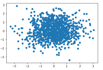
首先给出一个最基本的散点图示例:
1
2
3
4
5
6
| import numpy as np
import matplotlib.pyplot as plt
x = np.random.randn(1000)
y = np.random.randn(1000)
fig, ax = plt.subplots()
ax.scatter(x, y)
|
输出结果如下:
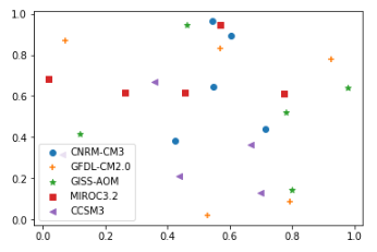
对于气象应用来说,往往是多组数据的散点对比,同时每组数据都要给出不同的图例及maker样式(比如这里给出了五组数据,每组数据有五个值):
1
2
3
4
5
6
7
8
9
10
11
| import numpy as np
import matplotlib.pyplot as plt
rng = np.random.RandomState(0)
markers = ['o','+','*','s','<']
labels = ['CNRM‐CM3','GFDL‐CM2.0','GISS‐AOM','MIROC3.2','CCSM3','MME']
fig = plt.figure()
ax1 = fig.add_subplot(1,1,1)
for i in range(5):
ax1.scatter(rng.rand(5),rng.rand(5),marker=markers[i],label=labels[i])
ax1.legend()
|
输出图形如下: