目前可以用SkillMetrics这个库中的相关函数来快速实现泰勒图的绘制。虽然总体效果还是差强人意,美感比NCL差不少,但好在简便可以快速出图了。
可以通过
1 | pip3 install SkillMetrics |
来安装这个库。
直接上绘图代码:
1 | import skill_metrics as sm |
图形输出:
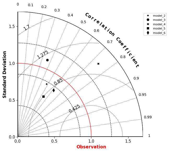
以下是sm.taylor_diagram函数所支持的参数:
基础参数
| 参数 | 说明 |
|---|---|
| alpha | Blending of symbol face color (0.0 transparent through 1.0 opaque) (Default: 1.0) |
| axisMax | Maximum for the radial contours |
| colFrame | Color for the y and x spines |
| colorMap | ‘on’ / ‘off’ (default): Switch to map color shading of markers to colormap (“on”) or min to max range of RMSDz values (“off”). Set to same value as option “nonRMSDz”. |
| labelWeight | Weight of the x & y axis labels |
| numberPanels | 1 or 2: Panels to display (1 for positive correlations, 2 for positive and negative correlations). Default value depends on correlations (CORs). |
| overlay | ‘on’ / ‘off’ (default): Switch to overlay current statistics on Taylor diagram. Only markers will be displayed. |
当ColorMap = ‘on’ 时:
| 参数 | 说明 |
|---|---|
| cmap | Choice of colormap. (Default: ‘jet’) |
| cmap_marker | Marker to use with colormap (Default: ‘d’) |
| cmap_vmax | Maximum range of colormap (Default: None) |
| cmap_vmin | Minimum range of colormap (Default: None) |
Marker 设置
| 参数 | 说明 |
|---|---|
| MarkerDisplayed | ‘marker’ (default): Experiments are represented by individual symbols |
| ‘colorBar’: Experiments are represented by a color described in a colorbar |
当 MarkerDisplayed = ‘marker’
| 参数 | 说明 |
|---|---|
| markerColor | Single color to use for all markers |
| markerColors | Dictionary with up to two colors as keys (‘face’, ‘edge’) to use for all markers when ‘markerlegend’ == ‘off’ or None. If None or ‘markerlegend’ == ‘on’, then uses only the value of ‘markercolor’. (Default: None) |
| markerLabel | Labels for markers |
| markerLabelColor | Marker label color (Default: black) |
| markerLayout | Matrix layout for markers in legend [nrow, ncolumn], e.g. [4,None] for 4 rows and [None,3] for 3 columns. (Default [15, no. markers/15] ) |
| markerLegend | ‘on’ / ‘off’ (default): Use legend for markers |
| markers | Dictionary providing individual control of the marker label, label color, symbol, size, face color, and edge color (Default: None) |
| markerSize | Marker size (Default: 10) |
| markerSymbol | Marker symbol (Default: ‘o’) |
当MarkerDisplayed = ‘colorbar’时:
| 参数 | 说明 |
|---|---|
| cmapZData | Data values to use for color mapping of markers, e.g. RMSD or BIAS (Default empty). Used to make range of values appear beside color bar. |
| locationColorBar | Location for the colorbar, ‘NorthOutside’ or ‘EastOutside’. |
| titleColorBar | Title of the colorbar |
RMSD的相关设置
| 参数 | 说明 |
|---|---|
| colRMS | RMS grid and tick labels color. (Default: green) |
| labelRMS | RMS axis label (Default: ‘RMSD’) |
| rincRMS | Axis tick increment for RMS values |
| rmsLabelFormat | String format for RMS contour labels, e.g. ‘0:.2f’. (Default ‘0’, format as specified by str function.) |
| showlabelsRMS | ‘on’ / ‘off’ (default): Show the RMS tick labels |
| styleRMS | Line style of the RMS grid |
| tickRMS | RMS values to plot gridding circles from observation point |
| tickRMSangle | Angle for RMS tick labels with the observation point. (Default: 135 deg.) |
| titleRMS | ‘on’ / ‘off’ (default): Show RMSD axis title |
| titleRMSDangle | Angle at which to display the ‘RMSD’ label for the RMS contours (Default: 160 degrees) |
| widthRMS | Line width of the RMS grid |
标准差的相关设置
| colSTD | STD grid and tick labels color. (Default: black) |
|---|---|
| colsSTD | STD dictionary of grid colors with: ‘grid’, ‘tick_labels’, ‘title’ keys/values. If not provided or None, considers the monotonic ‘colSTD’ argument. (“Default: None”) |
| rincSTD | Axis tick increment for STD values |
| showlabelsSTD | ‘on’ / ‘off’ (default): Show the STD tick labels |
| styleSTD | Line style of the STD grid |
| tickSTD | STD values to plot gridding circles from observation point |
| titleSTD | ‘on’ / ‘off’ (default): Show STD axis title |
| widthSTD | Line width of the STD grid |
相关系数的相关设置
| 参数 | 说明 |
|---|---|
| colCOR | CORRELATION grid color. (Default: blue) |
| colsCOR | CORRELATION dictionary of grid colors with: ‘grid’, ‘tick_labels’, ‘title’ keys/values. If not provided or None, considers the monotonic ‘colSTD’ argument. (“Default: None”) |
| showlabelsCOR | ‘on’ (default) / ‘off’: Show the CORRELATION tick labels |
| styleCOR | Line style of the CORRELATION grid |
| tickCOR[panel] | Tick values for correlation coefficients for two types of panelsCOR grid values |
| titleCOR | ‘on’ / ‘off’ (default): Show CORRELATION axis title |
| titleCORshape | The shape of the label ‘correlation coefficient’. Accepted values are ‘curved’ or ‘linear’. (Default: ‘curved’) |
| widthCOR | Line width of the COR grid |
观测点设置
| 参数 | 说明 |
|---|---|
| colOBS | Observation STD color. (Default: magenta) |
| markerObs | Marker to use for x-axis indicating observed STD.A choice of ‘None’ will suppress appearance of marker. (Default None) |
| styleOBS | Line style for observation grid line. A choice of empty string (‘’) will suppress appearance of the grid line. (Default: ‘’) |
| titleOBS | Label for observation STD point on axis |
| widthOBS | Line width of the observation STD circle |
—————————————————以下是老版本,不删了留个记忆————————————————————
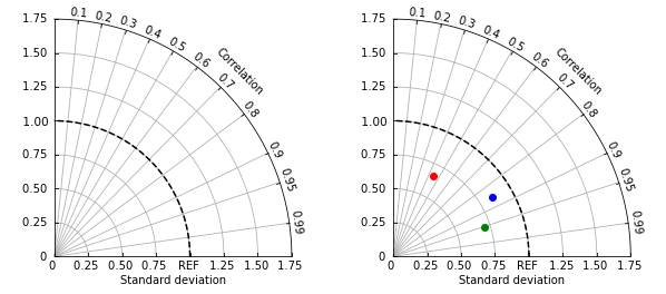
泰勒图绘制的核心思想是设计一个只有第一象限的极坐标,并将方差,相关系数进行捆绑,通过转化为极坐标系坐标进行绘制。为了实现泰勒图的绘制,设计了两个函数:
set_tayloraxes(fig, location=111) 和plot_taylor(axes, refsample, sample, args, *kwargs)
set_tayloraxes()函数用于建立一个泰勒图的坐标系,这个自定义函数一般情况下不建议修改,每一个参数都是经过多次调试得到的,很可能牵一发动全身。因此,将绘图部分的独立成为了plot_taylor函数(),这部分函数较为简单,目的就是将需要绘图的数据,转换为极坐标系坐标,通过plot函数将散点打在泰勒图上,这个函数模块较为简单,可以根据自己的输入数据情况进行调整。
下面直接给出两个函数的完整代码:
1 | from matplotlib.projections import PolarAxes |
下面介绍下函数的具体用法:
1 | setup_axes(fig, rect=111) |
输入:
fig: 需要绘图的figure
rect:图的位置,如111为1行1列第一个,122为1行2列第2个
输出:
polar_ax:泰勒坐标系
1 | plot_taylor(axes, refsample, sample, *args, **kwargs) |
输入:
axes : setup_axes返回的泰勒坐标系
refsample :参照样本
sample :评估样本
args, *kwargs :plt.plot()函数的相关参数,设置点的颜色,形状等等。
下面给出示例:
1 | x = np.linspace(0,10*np.pi,100) |